Why Most Landing Pages Feel Cheap Even When They Look Modern
A modern UI is not the same thing as a credible offer. The gap between those two is where most landing pages lose people.
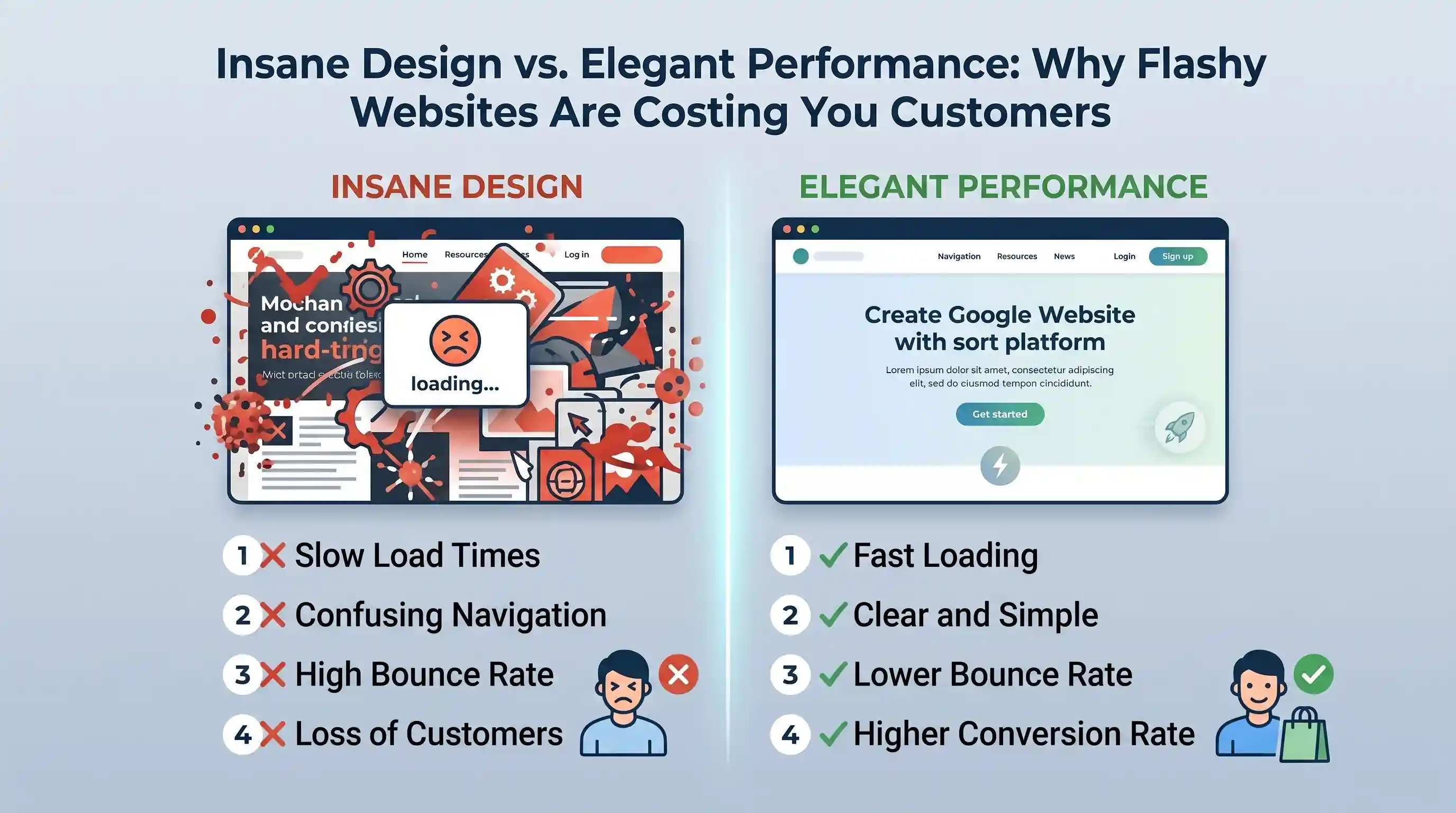
A lot of landing pages look current but still fail to persuade. They use the right gradients, the right typography, and the right animation patterns, but the page still feels disposable. That usually happens when the design is doing all the talking because the offer itself is weak or vague.
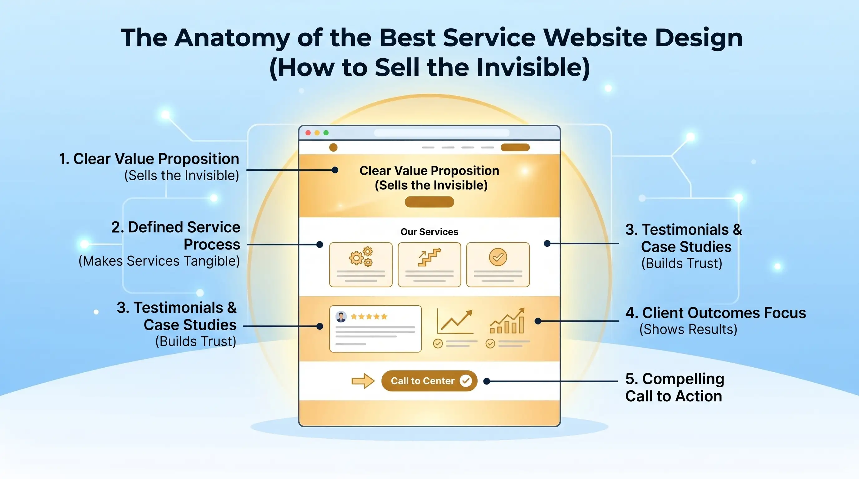
Good landing pages have a strong point of view. They know exactly what problem they solve, who they are speaking to, and why this solution is worth attention right now. Once that is clear, design can amplify trust instead of trying to manufacture it.
The fastest way to make a landing page feel premium is not to add more decoration. It is to remove generic language. Replace 'we help businesses grow' with a specific outcome. Replace filler testimonials with proof that shows the work is real.
People are better at spotting recycled marketing than most teams think. If a page sounds like everyone else, it will perform like everyone else.